
Container Queries
As the web has evolved, we have moved to using more and more components. Be it frontend frameworks like React or Svelte, or templating languages like Laravel Blade; all of them depend on the concept of components. These components can be used inside dialogs, split-screens, or the main content area, meaning their size requirements can vary widely. Luckily for us, CSS has caught up with this trend and has introduced a new feature called Container Queries, which allows us to style components based on their container size.
You may be wondering, “Hasan, we already have media queries!”. And you are right, of course, but media queries are based on the viewport size. Wouldn’t it be nice if your component could be aware of its container size and adjust accordingly? And all that without a single line of JS? Now that I have your attention (hopefully), let’s dive in.
When to use Container Queries
Below I am rendering a simple ManagerCard component that we use in bunch of places in Sematext. This is a simplified (and cruder) version of the original component.

- Live Demos
- Pricing Optimization & Custom Plans
- Best Practice Sharing
- Roadmap Sneak Peek and Feature Requests
The component can be rendered in different places on our site as shown below:
Before I introduced container queries, we had to pass additional props like “minimal” to the component to adjust its sizing depending on where it was rendered. This could become overly complex as we continued to add it in different places. This becomes worse when you consider smaller screens like tablets.
But with container queries, it doesn’t matter where this component is used. It will automatically adjust its styling based on the space available. This allows us to get rid of the additional props and makes the component more reusable and easier to maintain.
How to use Container Queries
Let’s see how we would use container queries to style the ManagerCard component.
To begin with we need to define a container and set the container-type property:
The container-type property can have 3 possible values:
size: Uses width and height of the containerinline-size: Uses width of the containernormal: The element is not a query container
We will explain in a little more detail what these values mean, but first, let’s see how we use the query part of container queries.
Just like media queries, we tell the browser to apply specific styles when the container size is less or greater than a certain value. In this case, we are changing from block to flex when the container is greater than 660px.
Container Condition
Another added advantage of using container queries is that we can use a much more comfortable syntax for our size conditionals. The min and max width syntax will also work, but I find this new syntax more in line with the rest of our programming languages. Unlike media queries, the container query rule set has a much more dynamic condition set. Here are a few neat examples directly from MDN. I would highly recommend the article to look at all available options.
Container Name
By default, the container query will apply styles based on the nearest parent with a containment context. However, there may be times when you would like to control the containment context that your container query is based on. For this, we can use the container-name property.
You can also use shorthand for setting container name and type:
Container Query Gotchas
Container queries disable the ability of the element to obtain size information of the container from its content. As soon as you define an element as a container, it will collapse, irrespective of the content it has, unless you specify the width and height of the container explicitly.
This is where we revisit the container-type property. As we saw, we have three possible values for the
container type. We don’t care about the normal value as that is just the default for elements and
means we don’t have any container query size calculations for the container. The other two properties
allow us to access the magic of container queries. When using container-type: size, the queries can
check both the width and height of the element. This also means that we have to specify both the
width and height of the container.
In my experience, container-type: inline-size is the most useful one. For one thing, you only need to specify the width of the container. And mostly for applying styles, I find that the width of the container is more important than the height.
Usage in TailwindCSS
If you are like me and love Tailwind, then you would be pleased to know that Tailwind also supports container queries. This support is not out of the box, but there is an official plugin, tailwindcss-container-queries, that helps you write container queries today.
Here is how you would use it:
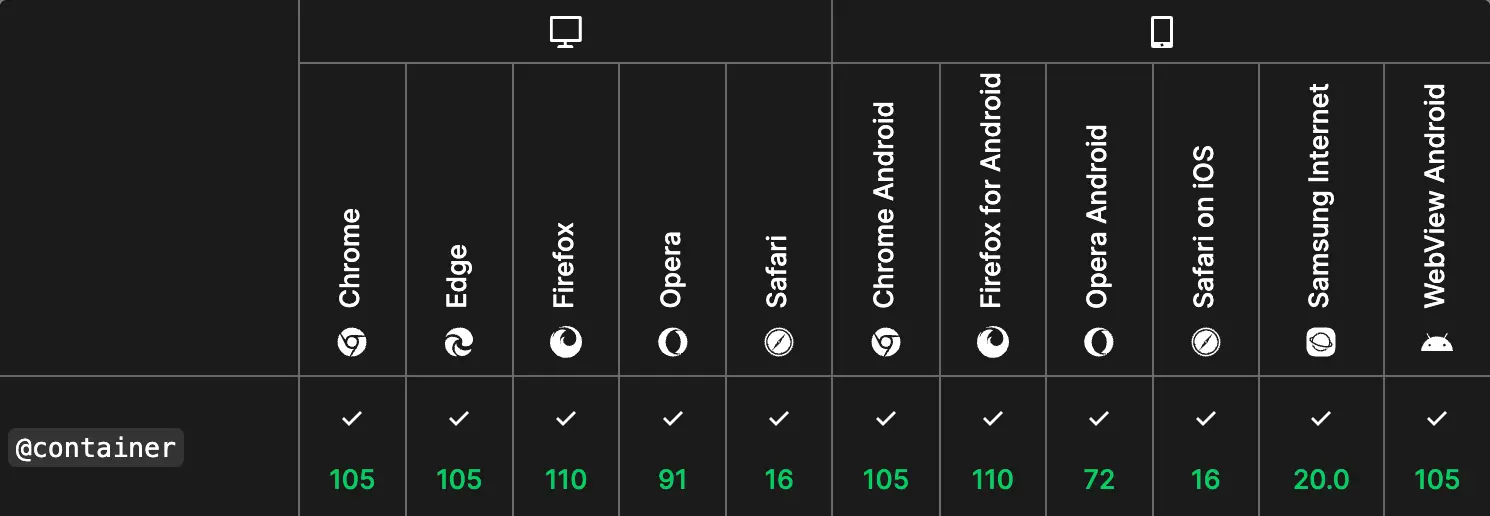
Browser Support
Well, the good news does not end here! Container queries are now supported in all major browsers, and you can safely use them in production sites today.
Conclusion
Container queries are one of the best features that have been added to CSS in recent years. They fit so well with the component architecture of the web today. Not only are they easy to use, but they also have great browser support today! So go out and give it a try 🚀.